RATINGS:
Graphics: 6
Gameplay: 3.5
Sound: 4
Overall: 4.5
Pros: Pretty well-done artwork that sadly lacks in variety. For an Asian game, quite accurate English NPC dialogues without any of those awful translations these MMOs typically show.
Cons: Too much automation resulting in zero gameplay, leaving the feeling of watching a film while having to abundantly use your left mouse button.
We had a first glance at League of Angels, the recently launched fantasy role-playing MMO developed by Uuzu and published by R2Games. Directly playable in any internet browser, the game thrusts players into a fantasy world where they roam the land, encountering various angels they recruit to their cause. Right from the start, you are put in the shoes of the saviour of the world, basically being the only hero capable of fighting off the “Dark Lord” as far as the linear story goes. League of Angels as such is a point & click MMORPG that has players complete quests, battle all kinds of enemies and gather loot, heaping masses of XP on them – really, they slather it around.
Our adventure starts with logging in and choosing our server. We are instantly transferred to some abyss apparently beneath the water surface where we get to encounter Nocturna, an angel currently in a weakened state and imprisoned. In order to free her, it’s our task to defeat some dark guardians including a boss type NPC known as Akayla. Combat takes place in an instanced area that requires a loading screen to load up and completely relinquishes player involvement. The instant you enter battle, the enemy will attack after some dialogue, at which you then respond in form of automated counter-attacks (at this stage, it’s not obvious if you are able to choose between different attacks). Then suddenly Nocturna appears on stage to help you as she did in the fight against Akayla. In this context, "help you" pretty much signifies that she's slaying the boss for you.
This is the point where we get to pick our class between the mage and the warrior, both of which offer prefabricated artwork for a male and female version. There isn’t any option to customise your character at all, just the possibility to decide for a name. This basically means that the moment you load into the game, each and every player looks exactly the same, which just feels sort of lazy.
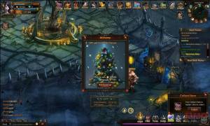
We are afterwards transported to the world tree in ElfVillage to talk to a certain Elven high Lady who then goes on sending us out on our next adventure to get rid of some other enemies. The process pretty much resembles the one describe above, as soon as you are in rage of the bad guys they start to attack, you hit back causing very little damage, then Nocturna emerges to erase everything on scene with her wondrous "White Lightning". At the end of decisive battles, players receive a grade/ score (we always got "S" for all of our battles during our test, which is the best score and absolutely undeserved as we didn’t do anything), as well as the opportunity to draw one of four cards that will either grant gold or the chance to obtain an Astral Tear that can be used to level up your angel.
As you advance in the game, new features are unlocked. However, given the fact that you are getting hell of a lot XP thrown at you (we managed to reach level 14 during our 22-minutes-long play test), it seems sort of useless to gradually introduce the game features when you level up this rapidly. We decided to have a breather to take a glimpse at those features, realising that most of them revolved around granting loot and gear for continuous play, possibly to compensate for what the game itself lacks. It was not an easy task to figure out the function of all of them as you get very little information about them, they were plainly just unlocked. In contrast, everything else gave hints what to do - even at level 14, the "left click to continue" message to skip to the next dialogue continued to popup...
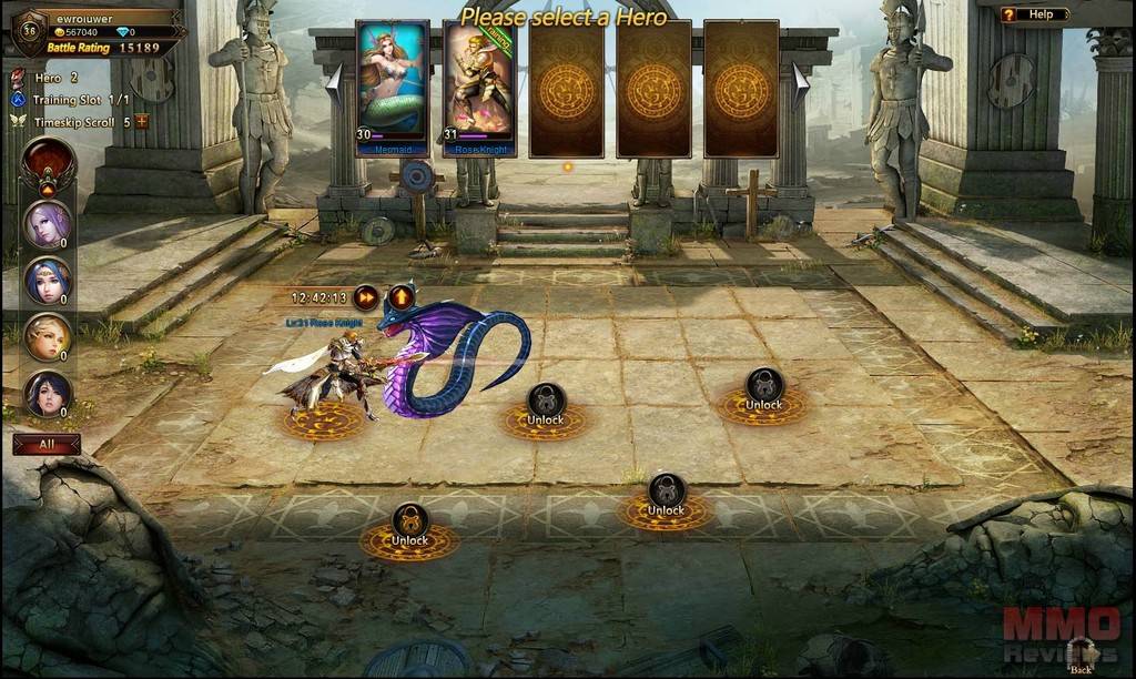
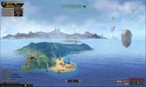
We can’t say the digital artwork for both the environments and the character designs looks too shabby. In fact, it’s pretty good, but even on only our third quest where we were sent to a new location to go to Ashaphs Shrine, we were presented with exactly the same environmental artwork that we’d seen merely 5 minutes before when doing the Temple of the Moon quest. Again we had the feeling that they were cutting corners with the game. Likewise for the music, whilst atmospheric in places, it became apparent on some occasions that the tracks were short, staggered and looped. In addition, there were no sound settings to turn down the game/ music volume, just a simple mute button, which was even more annoying.
Besides the artwork, which is the only real redeeming quality, the game actually provided (at least in our trial) very little that really left us wanting to go on playing and maybe try out some of the other features. The gameplay revolved around clicking to read the next NPC quest dialogue – clicking a quest in our journal to then automatically run to it – clicking a mob to be taken into automated combat; the whole experience felt like an interactive novel where we were just clicking our way through the story and reading and not actually playing an MMO at all.
Deja tu comentario
You must be logged in to post a comment.